
by Ryan Henson Creighton, KeyMaster at LockQuest
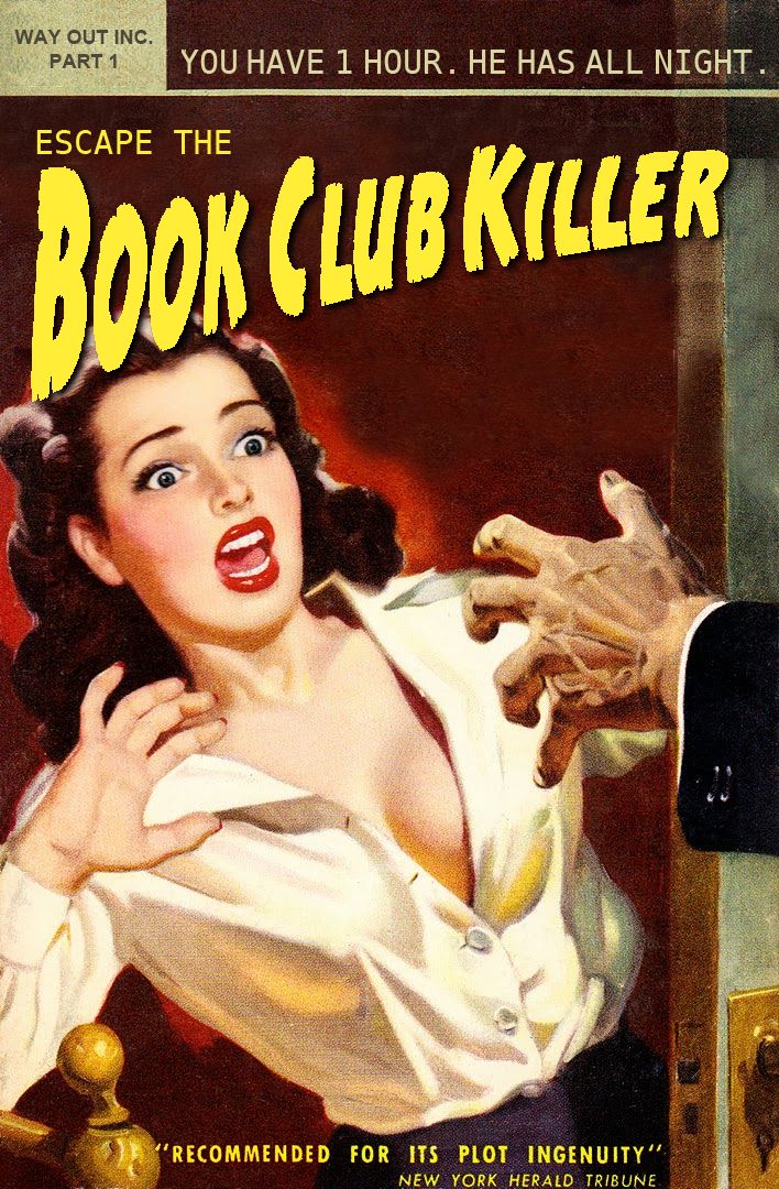
The poster for our debut live room escape game, Escape the Book Club Killer, is an homage to the dime novels of yesteryear.
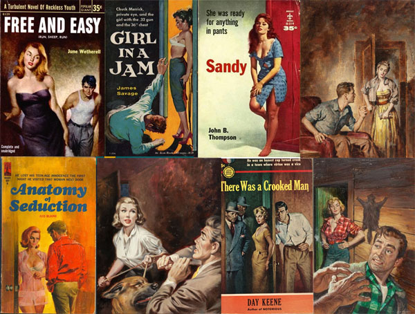
Pulp fiction novels, named for the cheap paper they were printed on, featured tawdry tales that were luridly illustrated, often by artists of questionable capability. For our game, I wanted a poster that handily summed up this artistic movement, and so I began to pore over pulps to see if there were common elements and themes I could pick out.
Pulp Fiction in Broad Strokes
Pulp covers can be broadly classified into a few coarse groups: crime, sci fi, men's adventure, war, horror, gay, and lesbian. I leaned heavily on the excellent PulpCovers.com for reference.
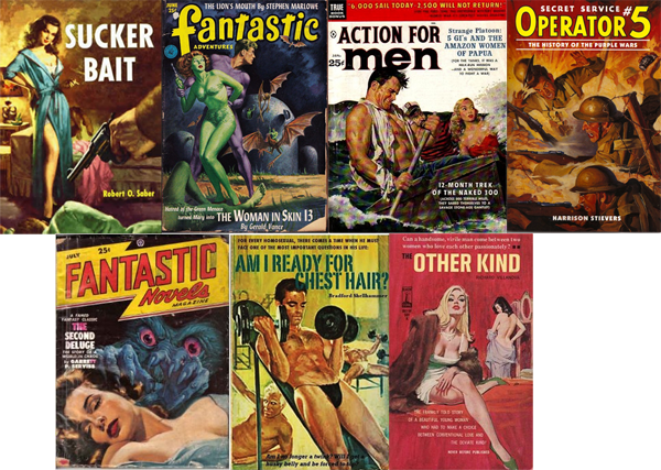
I narrowed my focus to the crime genre, because it was the best fit (though I kept an eye on those deliriously silly men's adventure mags, which we'll get to in a bit). Sexy ladies in various stages of undress - often "accidental" - was an obvious trope, so I knew our poster would have to contain a little bit o' sexist sleaze, with a female character suffering from an inexplicably popped blouse.

Boys vs. Girls
A great deal of pulp was exploitative towards women in ways that went beyond a boyish peek of side-boob behind a tightly-clutched bedsheet. Very many covers had women chained up, shot, and manhandled in ways that really put me off, so I made an early decision to focus on campy sexiness, and avoid the darker side of the medium.

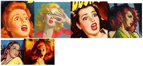
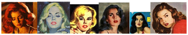
Being steeped in a feminist culture that's fighting back hard against the damsel in distress trope, the 40's/50's female swoon really stood out to me. Gone are the days when films and artwork would depict women raising the dainty backs of their hands to their foreheads, ruby-red lips agape in horror as they fought to stay vertical. The Swoon was such a funny time capsule depiction of women-in-peril that I knew we had to include it.
![]()
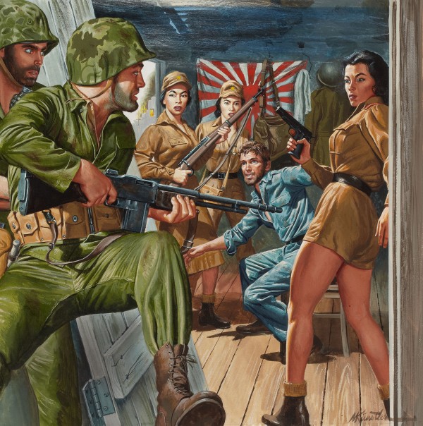
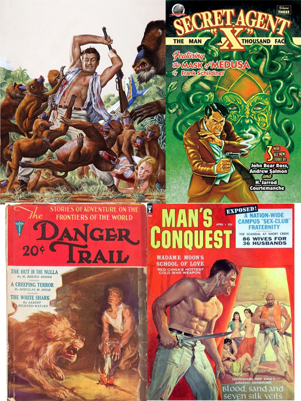
Eager to be an equal opportunity offender, I knew very early that I wanted both a male and female character in the poster design, and that the male would need to be in a similarly voyeuristic (and inexplicable) state of undress. Thankfully, those men's adventure mags obliged with copious images of ripped men in torn shirts, fending off all manner of vicious woodland creatures.


I loved the look of fear on the men's faces which, interestingly, is something we don't see in our depictions of men on movie posters and book covers these days.
The brood abides.
Today, we get only silent, smouldering dudebros - stoic mannequins who are mercilessly mocked if they deviate from the prescribed ramrod-stiff straight-ahead pose to convey a little emotion.
Bits and Pieces
There were a few more subtle tropes that I wanted to include, like the numerous open doorways I discovered
and, of course, the menacing veiny strangle-hands which sometimes held a gun or a noose, that were constantly lurking just outside the frame, provoking our heroes.

Race Disgrace
The escape game business in downtown Toronto sees about 50% Caucasian players, with about 30% Southeast Asian customers (escape games are massive in China, Japan, and Singapore). As a nod to inclusiveness, I considered making one of the two characters Asian. This was in conflict with my quest for authenticity; the depiction of Asian people in the pulps was clearly based on artist's viewings of popular movies at the time, where white actors were cast as Asian characters. (Think Charlie Chan, The Ten Commandments and The King and I.) Any Asian person in a pulp cover is really just a white person with questionable eye makeup.
My choices were to
- eschew authenticity by including a legitimate portrayal of an Asian person in the poster
- winkingly include a white-person-cum-Asian and risk cries of racism from viewers who didn't get the nod
- play it safe with two white characters.
Pulp imagery is dicey enough as it is. I stuck with two white people.
Star Search
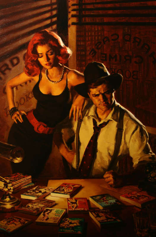
The artist I desperately wanted to commission was Glen Orbik, whose recent work for the pulp revival publisher Hard Case Crime set the bar impossibly high for this type of artwork.
Unfortunately, Glen was unavailable at the time, and so I set off on an exhaustive (and exhausting) search for an artist who could pull off the pulp style believably. I found it quite challenging to find contemporary artists whose work had the same rushed, brushy character of those early oil-painted pulps. There's something about digital painting that's far too clean for this aesthetic.
I used Trello to collect images and contact details from the artists who interested me.
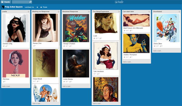
My lists were
- Leads
- Waiting on Response
- Received Response
- Too Busy/Expensive (every project has a budget!)
- Can start later
- Shortlisted
On the Mark
My search eventually led me to Mark Molchan, whose lead piece on his online portfolio blew my absolute mind.
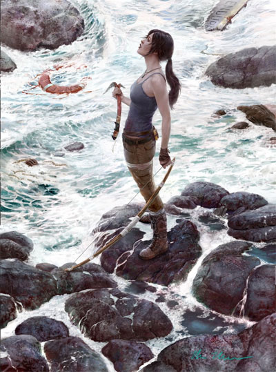
Is this real life?
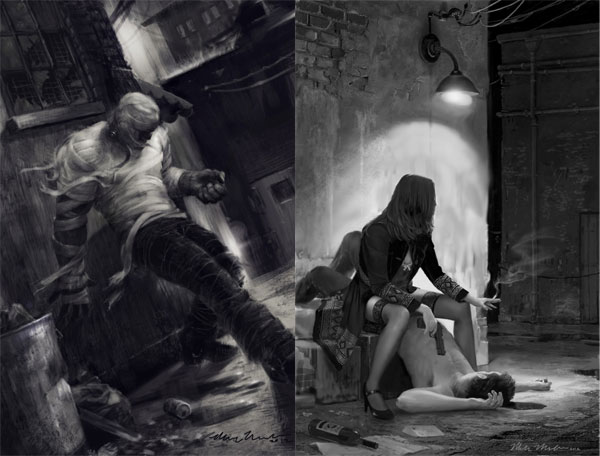
Scrolling further down the page, I discovered two more fantastic pieces that convinced me Mark could pull off that noir crime look I was after.
Pin It to Win It
One of the problems with working with an artist, especially remotely (I'm in Toronto, while Mark is near the opposite coast), is getting what's in your head out of your head to the degree where an artist can paint what you've imagined. I had a very specific image in my mind, down to the physical poses of the poster's two characters, so I knew I would need to be explicit about the details I wanted to see in the piece.
I also knew that Mark had not spent the last four months staring at pulp covers, so I wanted to provide him with enough source material and visual examples that my vision would be crystal clear in his mind. I needed an Internet-based brain transplant. That's where Pinterest came into play.
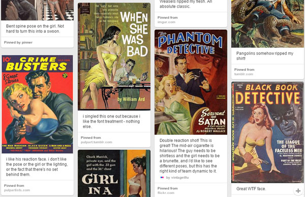
Pinterest is not just for collecting pictures of recipes that you'll never make. You can use it very effectively to communicate your vision to an artist. I started collecting pulp fiction covers with elements that I wanted Mark to include, making notes on each one to clarify which aspect of each piece appealed to me.
In some cases, I'd pin an ugly, violent cover because it had a great example of that stark open doorway trope. I'd drop in a note saying something like "focus on the doorway, not the strangled woman!" I tried to be clear about what I found attractive in pulp's female characters (I have a thing for redheads), and I wanted a very specific hunched-over pose from the guy, so that he looked ready to fight weasels at a moment's notice.
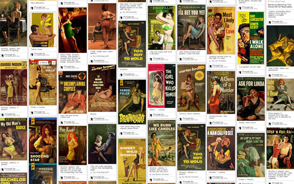
I created a second board for Mark with a collection of covers that had the type of palette I wanted to see - lots of greens, browns and yellows punctuated by red lips and red dresses.
These boards were kept private, shared only between Mark and me, until the poster was completed. I've switched them both to "public" now so that you can take a look:
- LockQuest Pulp Ficition Mood Board on Pinterest
- LockQuest Pulp Fiction Palette Board on Pinterest
Refined Crude
Mark's first few stabs at the poster looked like this:
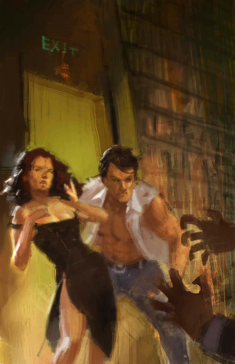
I preferred his first direction over his second, but asked him to nix the exit sign. That was to keep the artwork language-independent to support my plan for LockQuest franchise world domination (!), and because enough escape games use the word "Exit" in their names. (The last thing a business owner wants in an increasingly competitive industry is brand confusion!) I also asked Mark to put the man in khakis, to stay truer to the source material:
The book stacks had to go, too. I didn't want the poster to fraudulently depict any props or sets that players wouldn't find in the game. While Escape the Book Club Killer does include a book case, it's not packed with musty old volumes as illustrated.
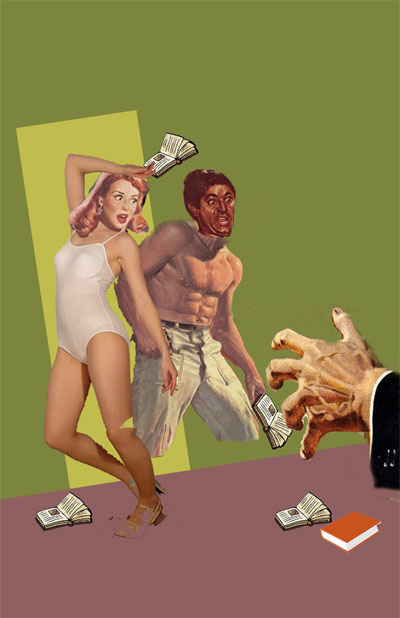
I needed to see Mark try that signature hand-to-forehead 50's ladyswoon. I knew that the two character's poses, which I imagined fitting together like two jigsaw puzzle pieces, would need to be seen to be understood. So I made an expertly Photoshopped comp for him so that he could nail it down in the sketch stage. The comp included elements from pulp covers and clip art from around the Internet:
I also included this early comp that I had presented to investors. It's a legit pulp cover with our game title shopped onto it, back when LockQuest was called "Way Out Inc." The lady in the picture has a nice swoony quality, and her white popped blouse has that uniquely mid-century mash-up of innocence and sleaze.
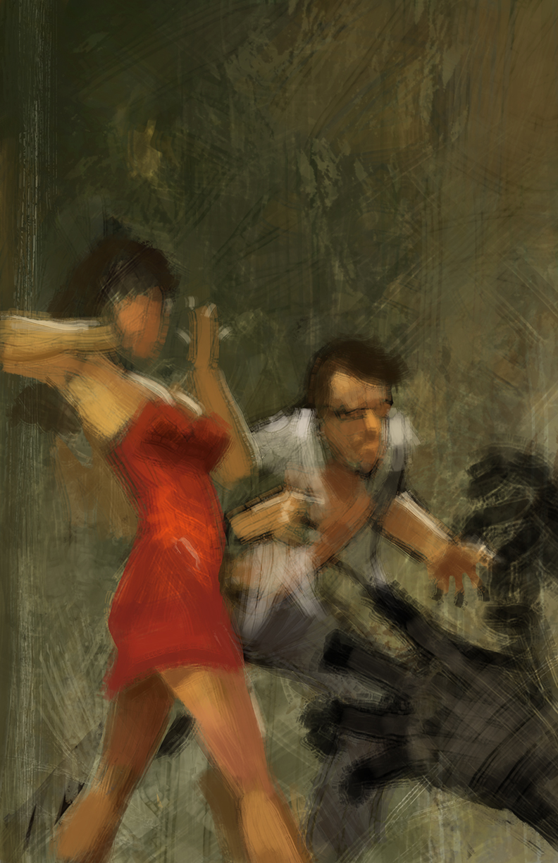
Mark's initial sketch evolved into this:
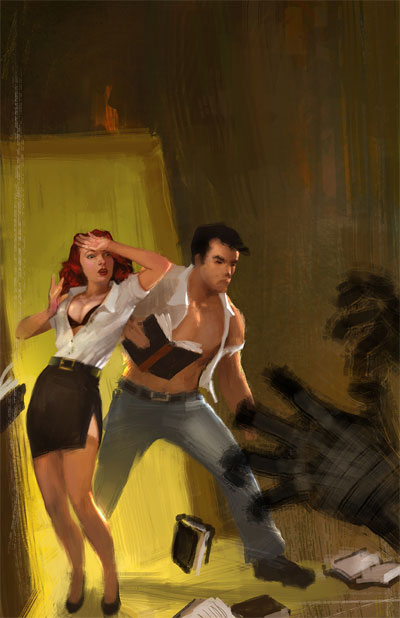
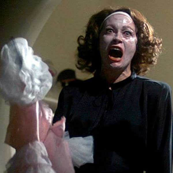
I thought the woman's narrow eyes were a bit too Mommy Dearest.
My directions included giving the woman fuller, redder, more parted lips, and making her eyes bigger:
putting a lock of hair in front of her face:
and giving her breasts softer lighting to make them look less like shiny balloons:

The man's pose was looking really good. I'd asked for him to be looking up at the threat while reading a book, as in "according to chapter 3, it appears as though ... HOKEY SMOKES - STRANGLEHANDS!" We agreed that Gregory Peck made for good 50's man-face reference.

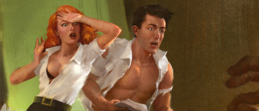
A few refinements later, and Mark had nailed it. I added the titles (which took a little bit of placement/copy advice from some artist and marketer friends of mine), and there we had it.

Everything about the process of creating the Escape the Book Club Killer pulp fiction poster went as smooth as butter. We wound up with a poster that was sexy, silly, and faithful to the pulp fiction reference material. I can roundly recommend Trello, Pinterest, and Mark Molchan for your next art commission!
Get Murdered
Tickets are now available for Escape the Book Club Killer at LockQuest in Toronto.